Website Navigation Design Patterns: The 2023 Guide
Design is one of those things that are very difficult to grasp. You can’t take one solution, copy and paste it to a similar project and expect it to work the same way. The designer should always be aware of the core elements, why they are where they are, and how to make them work for each particular case. Today, we will talk about one of the key elements of website design.
Introduction to website navigation design patterns
We live in a world, where the Internet has taken over businesses in seemingly any industry. According to Web Tribunal, over 2 billion websites are on the internet, with 400 million active. Kommando Tech claims that nearly 20 million of them are E-Commerce stores, what impressive competition just in one industry! Other industries like Manufacturing, Healthcare, Tourism, and Food Delivery have different amounts of websites, but the overall picture is similar.
Kickstand claims that an average user in the United States of America visits over 100 web pages per day. What can you do in order to make one of those pages to be yours? This is a complex question and there are a lot of elements involved, including SEO and Marketing efforts. However, when the user indeed ends up on your page, the website navigation design is king! We will share our expertise and experience on this topic so that you will be able to end up with a reasonable website redesign price during your reconstruction. In the following sections, we will break down the most popular types of website navigation, so you don’t have to!
“To design is much more than simply to assemble, to order, or even to edit: it is to add value and meaning, to illuminate, to simplify, to clarify, to modify, to dignify, to dramatize, to persuade, and perhaps even to amuse. To design is to transform prose into poetry.”
— Paul Rand, an American art director, and graphic designer
What is website design navigation?
Before getting into the patterns, let’s begin with the basics. Navigation design is a process of analyzing, creating, and implementing the ways users go through a website or a mobile app.
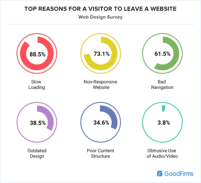
Bad navigation is one of the top reasons for users leaving a website:

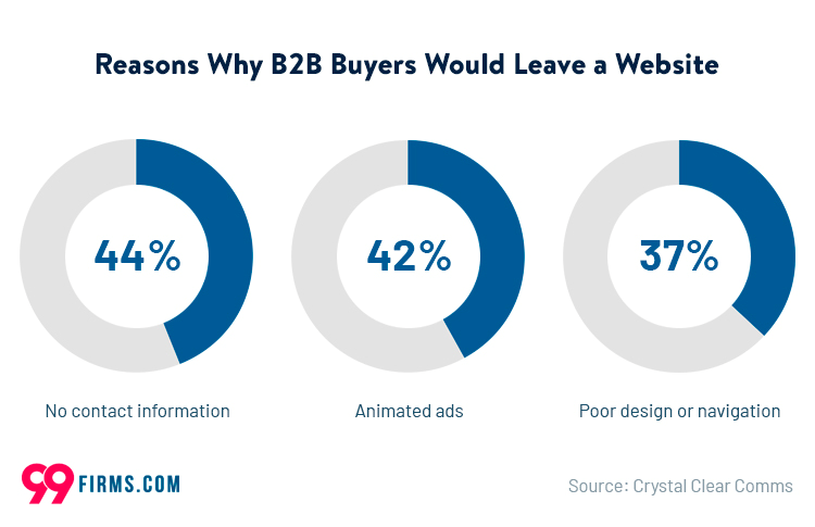
For B2B clients, this is also a very significant reason to leave:

The main goal of coming up with website navigation graphic design is to offer users the least frustrating journey from point A to point B. To achieve this result, the designer must combine User Interface patterns, as well as links, labels, texts, buttons, etc.
The best website navigation design can help you to achieve:
- Improve user experience and user understanding of your product
- Reduce the number of customers that you can potentially lose
- Increase sales and boost your revenue, as a result,
- Improve the reputation of your brand and overall business credibility
The key types of navigation that are used most commonly
Now, let’s discuss the most widespread website navigation structures in greater detail, as well as website navigation best practices on when to use each of them.
Top Horizontal Bar
This one is among the top two types of menus on websites. The traditional usage of top horizontal bars is in the role of the primary navigation menu. It is usually located right above or below the header of a web page. This type of navigation is often paired up with drop-down menus, and in combination, they offer multiple levels of navigation without taking up a lot of space on the page.
Key traits
- Text links are used, which are button-shaped or tabbed-shaped
- Horizontal navigation is placed near the website’s logo
- Most commonly located above the fold
Disadvantages
The biggest drawback with this element is a certain number of links that you can actually place in a bar without the need for adding sub-navigation menus. For a website navigation menu with a limited number of options, it is not a big concern, however, if you have a complex website with a variety of categories you should consider adding additional levels of navigation that we will talk about in the next sections.
Best usage
It is perfect for displaying up to 12 navigation items. While it also works great for primary navigation for single-column website layouts.
Tabs
Tabs can be styled any way you need, from realistically textured tabs to any styling you can imagine. This pattern can be used on any kind of website and are especially popular across mobile apps.
Tabs stand out among other website menu types by being intuitive. People can easily relate to tabs because they are used to their physical equivalent – tabs in notebooks.
Key traits
- Visually resemble actual tabs like in folders or binders
- More popular in horizontal orientation, however, you may find them in vertical position (vertically oriented tabs are called stacked tabs)
Disadvantages
Probably, the biggest disadvantage is the fact that tabs don’t work well for navigation with a lot of links, they may look messy and awkward in a design. Additionally, tabs require more markup, image assets, and CSS.
Best usage
While tabs may fit almost any type of navigation, they work better with a limited number of links and preferably horizontally.
Breadcrumb
The name originated from the fairy tale Hansel and Gretel, where the main characters left breadcrumbs throughout their journey to find their way back home. This is a very popular navigation structure of a website, and is commonly used on millions of websites. Breadcrumbs show exactly where you are on a website, and can be considered a secondary navigation that supports the primary navigation system.
Key traits
- Commonly looks like a horizontal list of text links with arrows pointing the direction of the hierarchy
- Always used as a secondary navigation and never as a primary
Disadvantages
- Breadcrumbs don’t work well with small websites with simple structures or websites that don’t have a clear structure and sole navigation destination
Best usage
Breadcrumbs fit best for the website with clearly defined sections, as well as multiple levels of categorizations. Without that, breadcrumbs can become confusing and negatively impact user experience.
Vertical Bar or Sidebar
In this pattern, the items are arranged in a single column, one on top of another. It is commonly placed on the top-left column, preceding the main content area. You can find this type of navigation on almost any website because this is one of the most versatile patterns that can include a lot of links.
Key traits
- Text links without icons for navigation items
- Rare usage of tabs
- A big number of links
Disadvantages
Because with this menu it is possible to put many links, you can easily put too many of them and hurt the overall UX and design. It will be a good idea to limit the number of links in your vertical bar and leverage fly-out sub-navigation menus to include everything needed.
Best usage
You can use this type of navigation for any website, especially one with a big number of links.
Search
In the last few years, search navigation become a very popular navigation method. Large E-Commerce websites with thousands of items can’t live without properly implemented search navigation functionality. This method will work best when your users know exactly what they want.
In combination with a good layout of the information, great search functionality will help your users search for items whether they know or don’t know what they want.
Key traits
- Often located at the top of a sidebar or a header
- Usually, search bars are repeated in the footer, a bottom part of a page
Disadvantages
The biggest disadvantage lies on the technical side. If you go with a ready-made solution for your platform, the actual search engine may work not as well as intended. Of course, you can always contact support and the manager may fix your issues, however, it will take time. A proper search engine is a strong argument for hiring a custom software development team and building the entire website from the ground up or adding search functionality as a feature. With a custom software development provider, you will always know for sure that your back-end part is covered and everything is working just as intended.
Best usage
Remember, that this is always secondary navigation. Having a clear and intuitive path to your pages is a key to great user experience. With that being said, if your platform has hundreds of pages, it makes sense to implement search functionality with different filters that can help to find what the user is looking for.
| The most popular website navigation design patterns | |
| Top Horizontal Bar Navigation | Perfect for primary navigation for single-column website layouts with up to 12 links |
| Vertical Bar or Sidebar Navigation | Great for designs with a huge amount of links |
| Tabs Navigation | Work great for horizontally oriented designs with a limited amount of links |
| Breadcrumb Navigation | Breadcrumbs fit best for the website with clearly defined sections, as well as multiple levels of categorizations |
| Search Navigation | Best fit for websites with hundreds of pages |
FAQ
What is website navigation design patterns?
This is the way to place the links on a website that will help the user to navigate through it. There are multiple popular patterns that fit different roles and goals.
What are the 5 types of website navigation?
The most popular include Top Horizontal Bar, Vertical Bar or Sidebar, Tabs, Breadcrumbs, and Search. However, there are many other useful patterns that may come in handy.
What is the goal of website navigation?
The goal is to provide the most logical and intuitive journey from point A to point B for the user. The designer should use different patterns and graphical elements in order to make this journey seamless for the end user.
What makes a good navigation design?
Just like with any other design, good design is an invisible design. When your users don’t think about navigation at all and just use the website, that means that the job is done well and this part of the user experience is covered.


